Friday, April 08, 2005

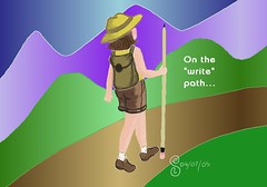
On the "Write" Path


(Click for larger image) This was going to be my entry for Illustration Friday's "TRAVEL" but I missed the cut-off date because of a nasty coughing bug I seem to have snagged that requires me to contort myself a la Cirque du Soleil in order to keep from having a brain aneurism, further straining my ab and rib musculature, and pee'ing myself when I have these severe coughing fits. Not totally happy with it, but it's just a draft anyway.

Thursday, March 31, 2005


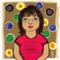
Bad self-portrait Posted by Hello

Tuesday, March 29, 2005

Playing...


(Click on image for larger view) Playing with the new version of Open Canvas - I still haven't figured out what all the tools are.

Saturday, March 26, 2005

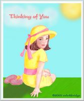
Happy Easter, everyone! God bless!


(Click for larger view)
Done in Open Canvas. Lettering and edges added with Photoshop.

Friday, March 25, 2005

ROLL OVER!


(Click on thumbnail for full image)

Well, what could be more crowded than 10 in a bed? Remember that children's song? That's the first thing that came to mind when I saw this week's Illustration Friday topic.

There were 10 in the bed when the little one said, "Roll over! Roll over!"
So they all rolled over and one fell out.
There were 9 in the bed when the little one said, "Roll over! Roll over!"
So they all rolled over and one fell out.
There were 8 in the bed...
You get the idea!
I think it ends with:


There were 2 in the bed when the little one said, "Roll over! Roll over!"
So they all rolled over and one fell out.
There was 1 in the bed and the little one said, "Good Night!"

Tuesday, March 22, 2005

Mrs. Calabash...


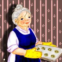
This is a character for a children's book I've written (but probably won't illustrate since I hear they don't like it when first time authors want to also be first time illustrators - besides, I'm not sure it's illustration quality). She was sketched and colored in Open Canvas, and then I did the background and shadow in Photoshop. Comments welcome. She's near and dear to my heart - her story has been in my heart and mind for over 6 years now and I have finally decided to submit (and face rejection head on).

Monday, March 21, 2005

Illustration Friday - BLOOM


(Click on thumbnail for detailed image) I wanted to do a variation on flowers... just a quick doodle in Open Canvas.

Thursday, March 17, 2005

YOUR HONEST INPUT VALUED! Please????


Please click on thumbnail to view full image. I did another baby in Open Canvas. I am hoping that you will take the time to give me an honest critique. While I know that I can draw "above average", I really want to improve my composition so I keep trying to add things. I would very much value and appreciate any honest critique, specifically in the following areas:
  1. What elements can I add or remove to improve the overall composition of the piece? Should there be more detail and small things added? Better background? "Texture"?
  2. How do I accomplish an overall consistency in my lighting and shading that would give the picture more depth? I have been experimenting and trying to learn from observing others.
  3. Is this sort of illustration suitable for greeting cards? Children's books? Magazines? My hubby and parents are hinting that I should parlay this into something that will at least justify all the time I spend doodling and sketching and all the money I spend on paper and art supplies.
  4. Should the lines be stronger? Brushstrokes? Are my illustrations too "blurry" or soft looking? I know in some cases, soft is good, but I often wonder if people want to clean their computer screens or glasses or rub their eyes because sometimes I think my stuff looks overly hazy. Maybe it's the translation into .jpg format or something.
  5. Do you have any helpful hints re dpi and resolution? If I'm going to do digital illustrations what format should I save them in that translates the colors best? I know that when I save something from Open Canvas to .jpg format and open it again in Photoshop, the color/appearance seems to change.

Because I am unable to attend any art classes or art groups right now, I value the critiques that I may get through this blog and my participation in things like Illustration Friday. I have been so encouraged by many of the participants who have taken the time to comment on my submissions. I love the positives but I really am hoping that I can improve my illustrations from the comments of others (besides, I have to learn to take criticism in a constructive way since I'm also trying to become an author and those rejection letters will be plentiful I'm sure).

While this is not fine art and I've never done an acrylic or oil or even real watercolor painting, I see this as a practice ground and will also venture into learning traditional mediums, starting probably with watercolor. I sketch with pencil and markers or I draw on the pen tablet. I have a cartoony style for some things and a "modified" realistic style (I think). I'm sure those aren't real art terms but it's about as close as I can describe it. I want to find my own style even though I love so much of what I've seen.

My biggest fans - my kids - always say, "Mom, you should be a professional artist!" - but I suspect they are biased. ;)

So, in advance, I thank you - I thank you for your honesty, your generosity and your critiques. Really, I'm not fishing for compliments! (But you can leave those too if it warrants it! *grin*)
Tuesday, March 15, 2005

Baby and Bunny


(Click on image for larger view)
Inspired by the positive feedback for my Illustration Friday post for FRAGILE, I thought I'd try another image of a baby... Comments welcome - still working on the shading thing. Done in Open Canvas - the thing with OC is that it's "paint based" so strokes push aside the other strokes... like paint - which I have NO experience with. This is so much fun learning!

Sigh - enough playing; back to work now.

Monday, March 14, 2005

Illustration Friday - FRAGILE


I thought of the fragility of infants... (Click on image for larger view.) Done in Open Canvas.

Sunday, March 13, 2005

Just a bit of "graphics" humor


(Click image to view larger) While thinking of ancient things, I had a funny thought... well, it was funny when I first thought of it.

Friday, March 11, 2005

Illustration Friday - Ancient 2


(Click on image for larger view... if you want to.)

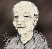
This file was originally called "Ancient Man Photoshopped to Death" - I just sketched an old guy with wrinkles in Open Canvas and then did the coloring in the ubiquitous Photoshop for practice. Ugh. I do NOT know how to apply proper shading! HELP!

Illustration Friday - ANCIENT


Pencil sketch on white bond, background misty swirly thing is Photoshop.

(Click the pic for larger view of image.) I have to use this sketch I did some time early last year (or was it late 2003?!??) for the Illustration Friday theme this week: ANCIENT. Dragons are ancient... aren't they? I mean they represent a time of ancient mythology... and they're so awesome to draw. I did this while I was sitting in a Starbucks feeling really angry about something and equating my rage with a fire-breathing dragon. Thankfully, almond triple-shot lattés are a wonderful panacea for most of what ails me. I'm really easy to please.

I had lots of other sketches of things (most of which have been covered fabulously in some shape or form at Illustration Friday). I did a few sketches of really old people but my son said he thinks they say "decrepit" more than "ancient." Then I did some tortoise and sea turtles and redwood trees and a couple of bad attempts at the Coliseum and Parthenon. However, since time is at a premium this week more than usual, here's my sketch. I appreciate anyone's comments and you don't even have to say it's good... I welcome any constructive criticism. Really - I can handle it. <_<

Tuesday, March 08, 2005


Let sleeping hogs lie...


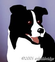
Border collie... *I miss my dog!*

Card idea for Easter... or whenever...


Done in Open Canvas and tweaked with Photoshop.

Playing...


This is my "Bulbous Bird" from a story idea... he's too fat to fly, that's why he looks so sad.

Sunday, March 06, 2005

Just a Little Sidebar...

I was surfing around when I came across this awesome animation created by Michael Levy to a recording by John Coltrane. It's inspiring and fits in with the last Illustration Friday theme of JAZZ... Enjoy! It's worth the time!

Friday, March 04, 2005

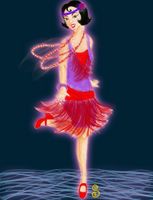
Illustration Friday - JAZZ 2 - Flapper


(Click to see larger image)
I couldn't resist doing a flapper... I had all these images in my head. I did this in Open Canvas and did the blur and glow effects with Photoshop. I wanted to capture a sense of movement - let me know if I succeeded. This is what it started off as (straight from Open Canvas).

I'm really trying hard to get better with technique and appreciate everyone's comments - constructive and complimentary. I don't have any tutorials... it's trial and error and making notes about what I'm doing that I like and what I shouldn't do because it looks like fudge. I do get inspired from looking at everyone else's fabulous work at Illustration Friday!

Thursday, March 03, 2005

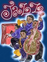
Digital Image - JAZZ 1 - Illustration Friday


(You know the drill - click on image for larger view.)
While I'm not totally happy with this, it was an exercise. Nothing ever appears on paper as it does in my mind. I wish I could just blink my eyes and make it appear like a Polaroid. But then, where would the artistry be in that? Anyway, I used Open Canvas and added the blue background, glow, and JAZZ (handwritten) with Paint Shop Pro. I more or less just scribbled and sketched with different colors like I would in a sketchbook. The pen tablet is pressure sensitive, but still not the same as a color pencil or pen.... :-/ This is a great topic (as observed by many at Illustration Friday already) and there can be so many takes on this. I thought about a jazz icon's portrait, but so many fabulous ones have already been done... like this one ... and this one ... and this one ... and this one ... well, you know.... There are tons of excellent entries and if I sat here and linked to them all, you'd never come back to my blog! I think I'll sketch a flapper - the Jazz Age was the 20's and 30's... Big Band was the 40's (I think). I like a lot of the big band stuff but PURE jazz... well, that was born of freedom - the first generation of African Americans out of slavery - I think that's the essence of Jazz... freedom. But I have to go now.