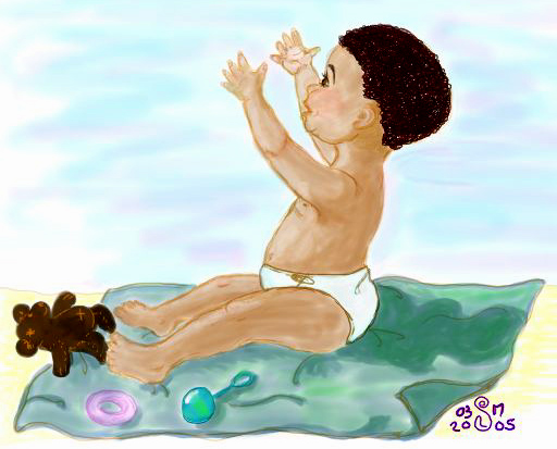
Please click on thumbnail to view full image. I did another baby in Open Canvas. I am hoping that you will take the time to give me an honest critique. While I know that I can draw "above average", I really want to improve my composition so I keep trying to add things. I would very much value and appreciate any honest critique, specifically in the following areas:
- What elements can I add or remove to improve the overall composition of the piece? Should there be more detail and small things added? Better background? "Texture"?
- How do I accomplish an overall consistency in my lighting and shading that would give the picture more depth? I have been experimenting and trying to learn from observing others.
- Is this sort of illustration suitable for greeting cards? Children's books? Magazines? My hubby and parents are hinting that I should parlay this into something that will at least justify all the time I spend doodling and sketching and all the money I spend on paper and art supplies.
- Should the lines be stronger? Brushstrokes? Are my illustrations too "blurry" or soft looking? I know in some cases, soft is good, but I often wonder if people want to clean their computer screens or glasses or rub their eyes because sometimes I think my stuff looks overly hazy. Maybe it's the translation into .jpg format or something.
- Do you have any helpful hints re dpi and resolution? If I'm going to do digital illustrations what format should I save them in that translates the colors best? I know that when I save something from Open Canvas to .jpg format and open it again in Photoshop, the color/appearance seems to change.
Because I am unable to attend any art classes or art groups right now, I value the critiques that I may get through this blog and my participation in things like Illustration Friday. I have been so encouraged by many of the participants who have taken the time to comment on my submissions. I love the positives but I really am hoping that I can improve my illustrations from the comments of others (besides, I have to learn to take criticism in a constructive way since I'm also trying to become an author and those rejection letters will be plentiful I'm sure).
While this is not fine art and I've never done an acrylic or oil or even real watercolor painting, I see this as a practice ground and will also venture into learning traditional mediums, starting probably with watercolor. I sketch with pencil and markers or I draw on the pen tablet. I have a cartoony style for some things and a "modified" realistic style (I think). I'm sure those aren't real art terms but it's about as close as I can describe it. I want to find my own style even though I love so much of what I've seen.
My biggest fans - my kids - always say, "Mom, you should be a professional artist!" - but I suspect they are biased. ;)
So, in advance, I thank you - I thank you for your honesty, your generosity and your critiques. Really, I'm not fishing for compliments! (But you can leave those too if it warrants it! *grin*)
6 comments:
the tangency between the bear & the boy's toes bothers me a little... i think it should be moved away, or maybe in front of or behind the boys leg. also the area where his chin meets his arm..
maybe vary line weight. all of the lines are about the same in their weight as it is now. make certain parts of the line stronger/wider. i think playing with that can add some "pop" to the illustration overall.
yea, your style is pretty blurry... but i just think it is the nature of the program you are using? i am unfamiliar with open canvas. maybe you are blending a little too much? i'd have to probably watch and see how you are drawing it to understand where the softness is coming from.
i think this sort of illustration would fit well in a parenting magazine. :) overall i think it has a lot of potential. it may help to draw the pieces (rattle, blanket, bear, etc.) on different layers (if your program allows) that way you can move them around more and position them where you want to. it makes life easier.
i'm not sure about your question pertaining to dpi and file type. do you mean for screen or print?
congrats on your motivation & desire to learn and grow in your style! best of luck!
Hi Elle,
I have to admit, I'm self-taught just like you. Never went to art school, so any critique I would give you would be based purely on my own personal tastes! But I can address some of your tech questions.
First, DPI. I work mostly in print, so my rule of thumb is to do each piece at 300 dpi at the largest size I can comfortably do it without taxing my computer's memory too much. Generally I try to fit it into an 8 1/2 x 11 format. I want to be able to use the illustration for as many things as possible, so even if it's just going to run as a spot in a publication I usually do it upsize for future uses. Just remember when you save it for the internet to save it at 72 dpi, which is all that the internet can show.
I'm not familiar with Open Canvas. I suspect you're using a PC? Anyway, Photoshop is pretty much the standard for showing colors accurately. But what you see on screen is NEVER the same as how it will look in print, no matter how well calibrated your monitor is. This is because a monitor uses light and a print uses pigments, which can never capture the brightness of light.
It's also common for colors to shift when you change programs. It's helpful to choose a color gamut and stick with it between programs. For instance, I always work in CMYK because that's what's used in the world of print. I just know after years of practice what 100 cyan and 40% magenta looks like, even if the screen display isn't quite accurate. I have a color library that I've tested and that I'm satisfied with and those are the colors I use.
Keep on practicing! That's been the key for me. Looking forward to seeing more.
Annie
It's interesting even for a "professional" illustrator to read and learn from other people's comments. For instance, how Annie has a color library she knows se can depend on to create specific colours. I need to do something like that!
I'll try not repeat any advice already given (but will reiterate Annie's advice about going 300 dpi and working in cmyk mode unless you plan to use the illustration for on screen (computer) use only, Then you can work in RGB mode and at 72 dpi, which will keep your file sizes down. Not that if you start in RGB and shift to cmyk, the colors will be different (usually darker in cmyk) Also, if you're working in Photoshop and are in Cmyk mode, you can't access some of the "artistic" brushes/effect. I get around this by creating a different file with that layer on it in RGB mode and then duplicating it to the main file after i'm finished using the effects. Then you can adapt it to fit the cmyk file using the various color adjustment tools.
I'm not familiar with Open canvas either. If you have Photoshop, I'd be inclined to use that to paint digitally. That's my process when working digitallly. I draw my illustration on paper, scan it in and then paint over it using the various layers in Photoshop. It takes a lot of practice and experimentation, but it's fun!
As to the light... the baby picture shows a certain understanding of lighting (coming from the left side), and you've shaded the baby's back created a shadow behind him, but the darker outline on the front (his face and belly) prevent him from looking realistic. In reality, that would be the area of highlight (lightest area) That can be a challenge with a profile, but if the background was darker so you could create more contrast, it could be achieved. Sometimes artists trying to achieve a more flat graphic look use strong outlines, but if you want it to look more dimensional (rounded) and real, then you should try to "model" the light around the baby. The same can be said about his legs. The colour would be darkest where his legs rest on the blanket and mold around the round contours of his thighs and knees.
One good source to study for dramatic color and use of light is comic book art (Frank Miller, Steranko, Burne Hogarth) They generally use it in a flat, graphic way, but I personally find it useful to see how they handle a variety of different lighting situations.
As regarding composition... I think the Baby needs a little more headroom (negative or white space) at the top. He's sort of plopped in the middle. I'd also like to see what he's reaching for... maybe just mom's arms (or whatever) entering the frame.
I see potential in the way you draw, but practice, practice, practice will help you grow. Also, I recommend going to your public library and getting all the books you can about figuring drawing and books on various artists works. If copy them to really understand they're methods. I do this all the time just to keep my skills sharp and learn something different or try new little tricks.
Keep working!!! Looking forward to watching you grow and evolve.
xo Wee (Melanie)
er... I meant "figure" drawing!
xo Wee ( http://weeme.diaryland.com )
Just a comment as a viewer, not otherwise...at this point :)
I personally like it very much. I'm not into this well enough to notice flaws or what could be done better, like I can in writing or photography. Your baby work reminds me of children's books from probably the 70s, 80s. I really love them, and I encourage you to keep in working on them!
You did a very nice job on proportions! I cannot draw or paint children for the life of me! Best with your art. I hope you pursue it further :)
Post a Comment